Opus 1
Opus 1 is my first generative art project. It’s an exploration of the circle packing algorithm, skeuomorphism, and my creative process in generative art.

Opus 1, The Fave

Opus 1, The Grid
Motivation
Generative art is massively inspiring to me a medium for expression, because it is the interaction of opposites: art with math, creative chaos with technical discipline, perfection with randomness, and cohesion with variety. Generative art and design also felt like the perfect intersection of all the skills and interests I’ve accumulated over the past 15 years. There’s one problem. I didn’t know how to program.
After a 18ish months of studying programming and p5.js casually, I started this project to explore generative calligraphy and to create a set of 16x20” prints. Ultimately, my goal was to experience the entire creative process from ideation to exploration to curation to printing and minting.
The Fave
I originally envisioned 4-5 final pieces for this project. However, I did not feel there was enough variation and quality in the algorithm curate so many images. It was the dilemma of spending more time on diminishing returns, versus closing out this project and doing better on the next one. I chose the latter, and settled on “The Fave”, because this output best embodied the energy of a cursive Chinese calligraphy.
Opus 1, The Fave - The final curated output of the Opus 1 algorithm, amongst 1000 total outputs.
The Grid
Curation was really tough. There were many outputs I liked. Eventually, the selection process came down to asking “what is the goal of this project?” … and the answer to that question could send the curation down different directions. After settling on “The Fave”, which best embodied the original vision of the project, I opted to collect the next top 16 outputs into a grid to document the variety of this algorithm. Overall, I feel that this diptych successfully captures the energy the brushstrokes, and also the space of possible glyphs.
Opus 1, The Grid - The next top 16 curated outputs from the Opus 1 algorithm.
Mechanics
This entire project is built on the circle packing algorithm, which is a simple algorithm that packs as many non-overlapping circles as possible within a boundary. By carefully controlling a few variables, it’s possible to create layouts that look like bubble and foam to layouts that looks planetary.
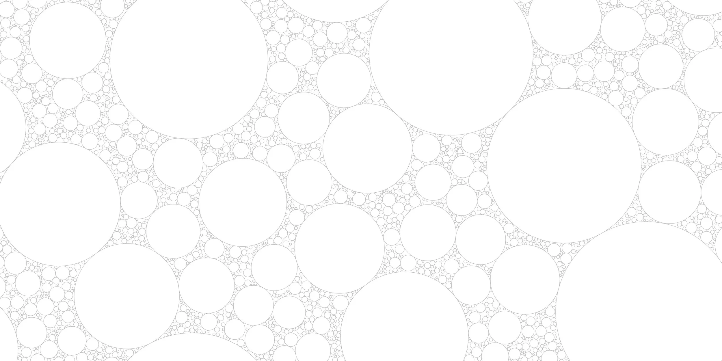
Example of a circle packing grid.
The image is drawn in 3 layers:
Paper
White rings
Brush stroke
The lowermost layer was my attempt to create a texture on the canvas that was loosely inspired by patterns on Chinese and Vietnamese silks. First, a circle packing grid is generated. Second, a handful of circles are randomly sampled from that grid. And third, an isometric random walk fills each of the randomly sampled circles.
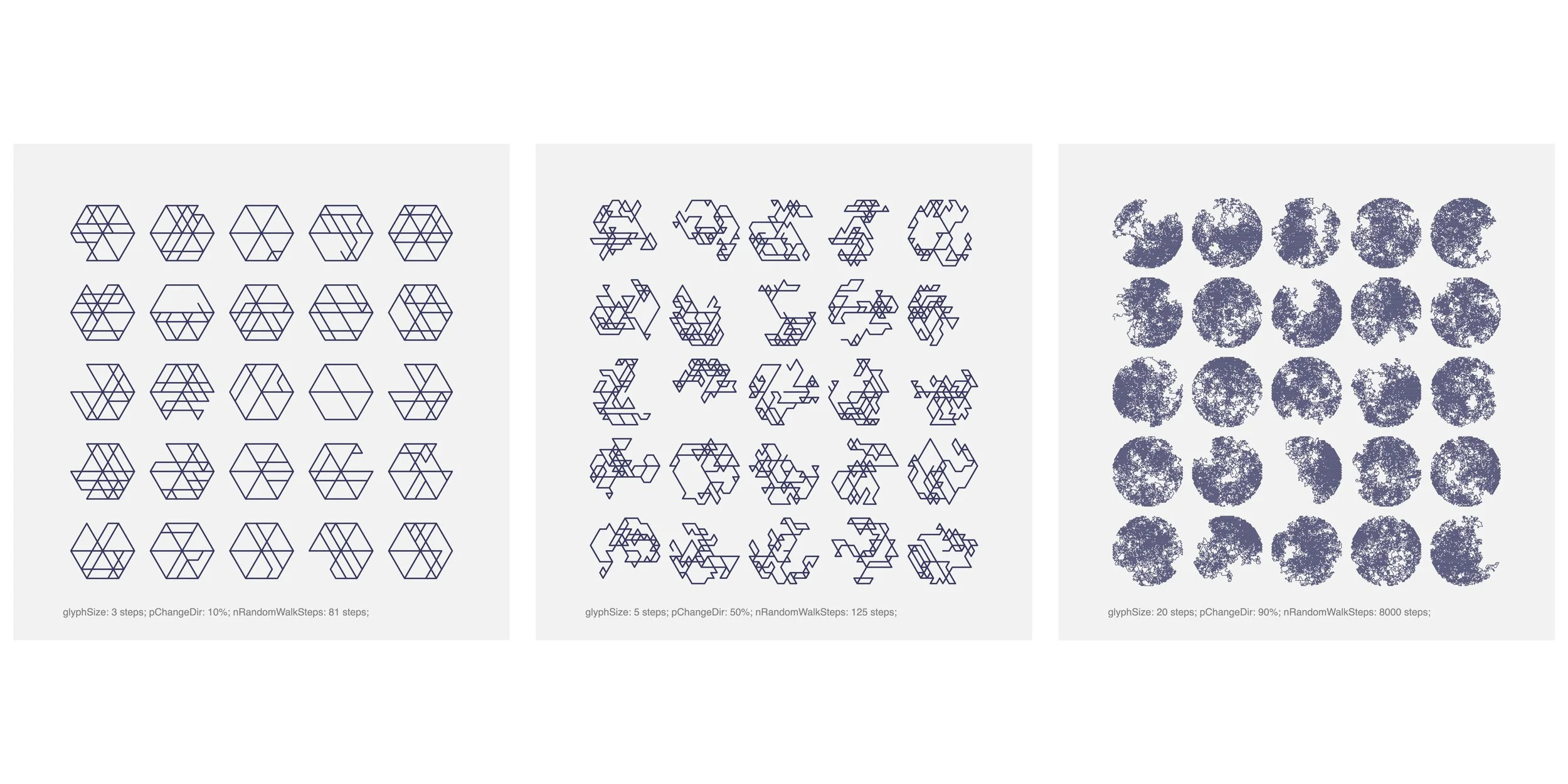
The isometric random walk can be parameterized as a 3-variable system: glyph size [# of steps], probability of changing directions, and number steps. Those variables were controlled to go between glyph-like shapes and texture for the base layer.
The middle layer of concentric circles is also an homage to Asiatic patterns and materials: the tessellated fan pattern. This layer was my exploration of using white as a color, rather than treating it as the negative space on the canvas. These rings are drawn on a random handful of circles sampled from a newly generated circle packing grid.

The white concentric circles are drawn using a new circle packing grid on top of the random walk texture. The random walks and concentric circles form the underlying paper for Opus 1.
The topmost, and most prominent, layer is the brushstroke. This layer starts by sampling a handful of random circles from a newly generated circle packing grid. The midpoints of the sampled circles are used as the drawing path for the glyph. The glyph is then drawn by calculating approximately 100 parallel paths using normal angles. Stroke weight and gray value are slightly varied for each parallel path.

The rendering of the brushstroke happens in 5 steps: (1) make the path, (2) calculate normal angles at each point to generate multiple parallel paths, (3 & 4) draw each parallel path using variable stroke weight and gray values, and (5) add ink splatter effect.
Prints
TBA